May 8, 2017
Rambus: Blockbuster Chartology - May 2017
By Catherine Austin Fitts
My "go to" website for technical analysis of precious metals, the US dollar & the US stock market is Rambus Chartology, where Rambus (that's his handle - he's the founding technical analyst) leads a discussion with extensive charts of what the markets are saying.
In our original Blockbuster Chartology, the Solari Report did a written interview with Rambus including an introduction here and a discussion of Rambus, his background, technical analysis as well as the word "Chartology." You can find all this information at our first interview:
- Why "Rambus?"
- How Rambus Chartology Got Started
- What Rambus Chartology Does
- About Technical Analysis
- Tracking the Markets
- What does the word "Chartology" mean?
- Rambus: Blockbuster Chartology
In January 2016, Rambus launched his quarterly Solari Report with a Blockbuster Chartology across the four market sectors: Currencies, Commodities, Precious Metals and Stock Markets. You can find it here: Rambus: Are We in a Deflationary Spiral? Then, Rambus returned with his Blockbuster Chartology across the market sectors in April, July and October. With 2016 behind us, Rambus returned with his first Blockbuster Chartology of 2017 in January. For the 1st Quarter, Rambus was sidelined by personal matters and so now joins us in May to take an in depth look at currencies, US and world stock markets and precious metals.
One of the reasons that Rambus is so good at his craft is that he focuses on "staying on the right side of the major trend." The challenge of doing so at this time is that it is tempting to look for bottoms or to assume that the trend upwards in the US dollar or stock market may be over. However, Rambus consistently brings us back to the discipline of the Chartology. What does price tell us? As he describes so aptly, we are dealing with psychological warfare.
Sitting back once each quarter to get this perspective offers invaluable insight. So, here we go for our second 2017 Blockbuster Chartology!
Blockbuster Chartology By Rambus
Currencies
Around the World with Chartology
Prepared on May 1, 2017As there seems to be a lot of interest in some of the currencies I would like to show you some charts we’ve been following for a very long time. Most of the charts will be long term in nature which won’t do us much good in the short term, but they will keep us in tune to the direction these currencies are most likely to take
Knowing what to expect in the Longer term is important not only to currency and commodity traders but to the very Countries who’s currencies are impacted and to their exporters and importers as well.
Long time members may remember some of these massive tops in 2011 which led to the sharp decline in the PM complex and commodities. I won’t spend a lot of time on these charts as they’re pretty self explanatory.

The $CAD, Canadian Dollar, has built out a massive double top formation, broke below the double top trendline in 2015, followed by a backtest.
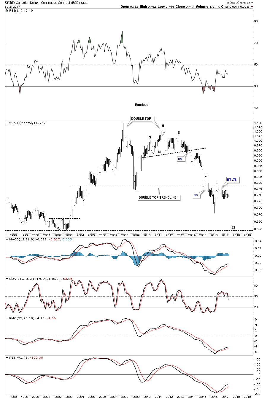
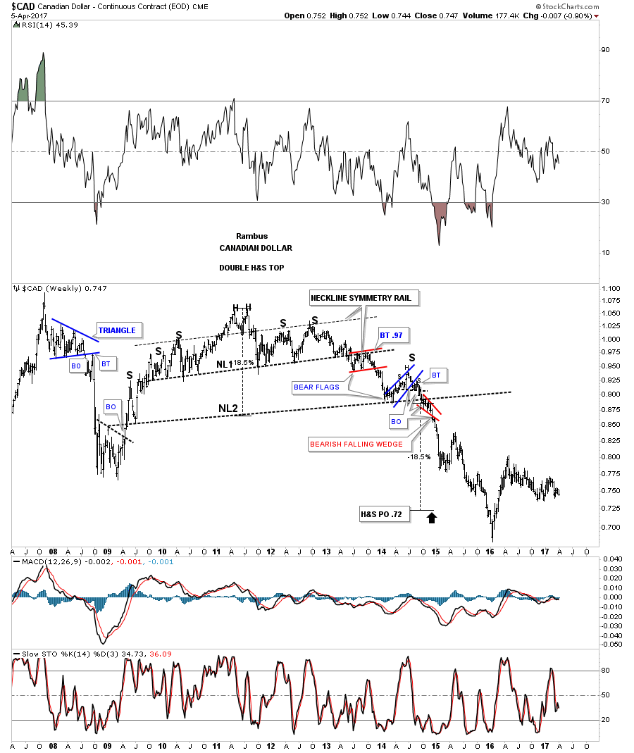
You may have noticed the H&S top which formed the right top. Below is the weekly chart which shows the double H&S top in more detail.

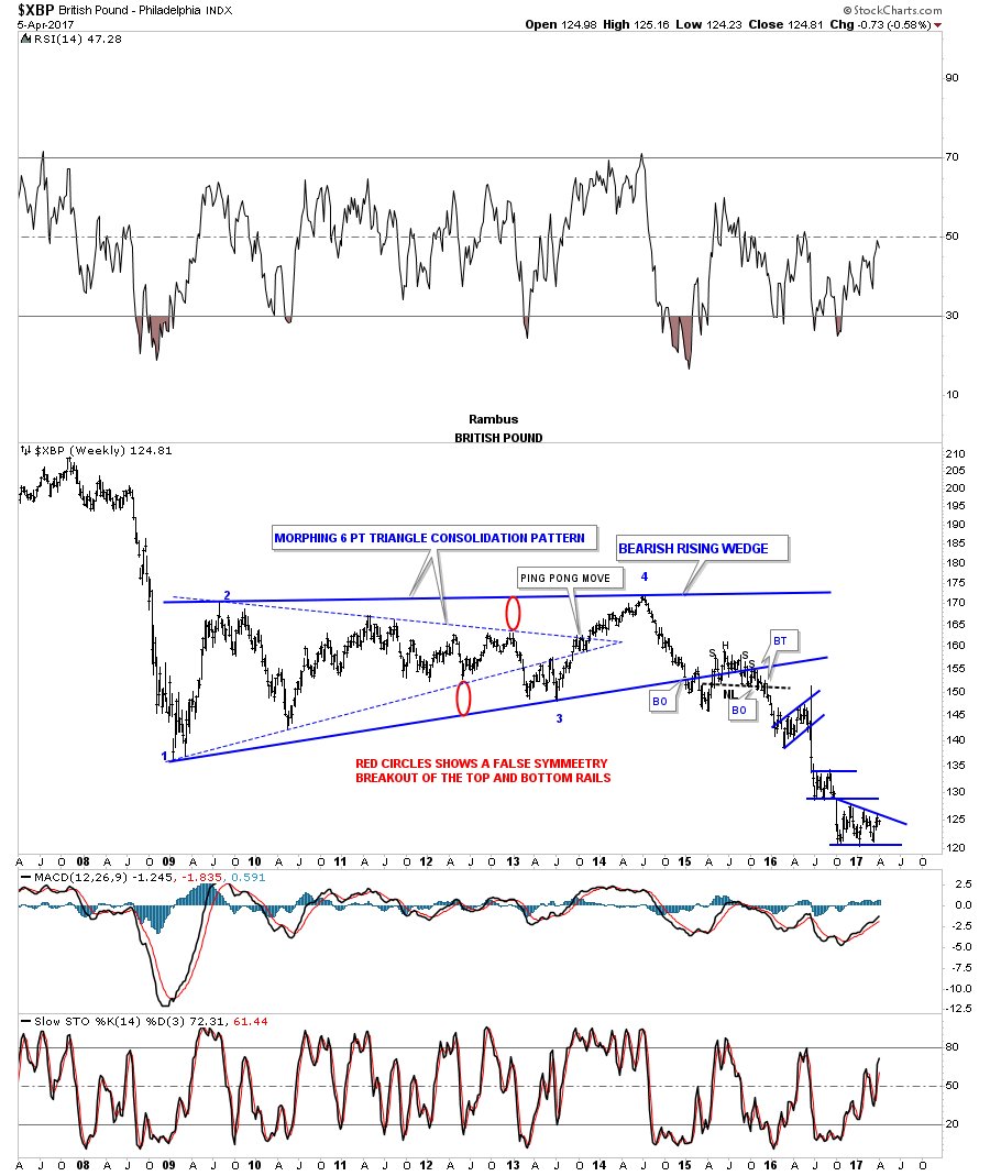
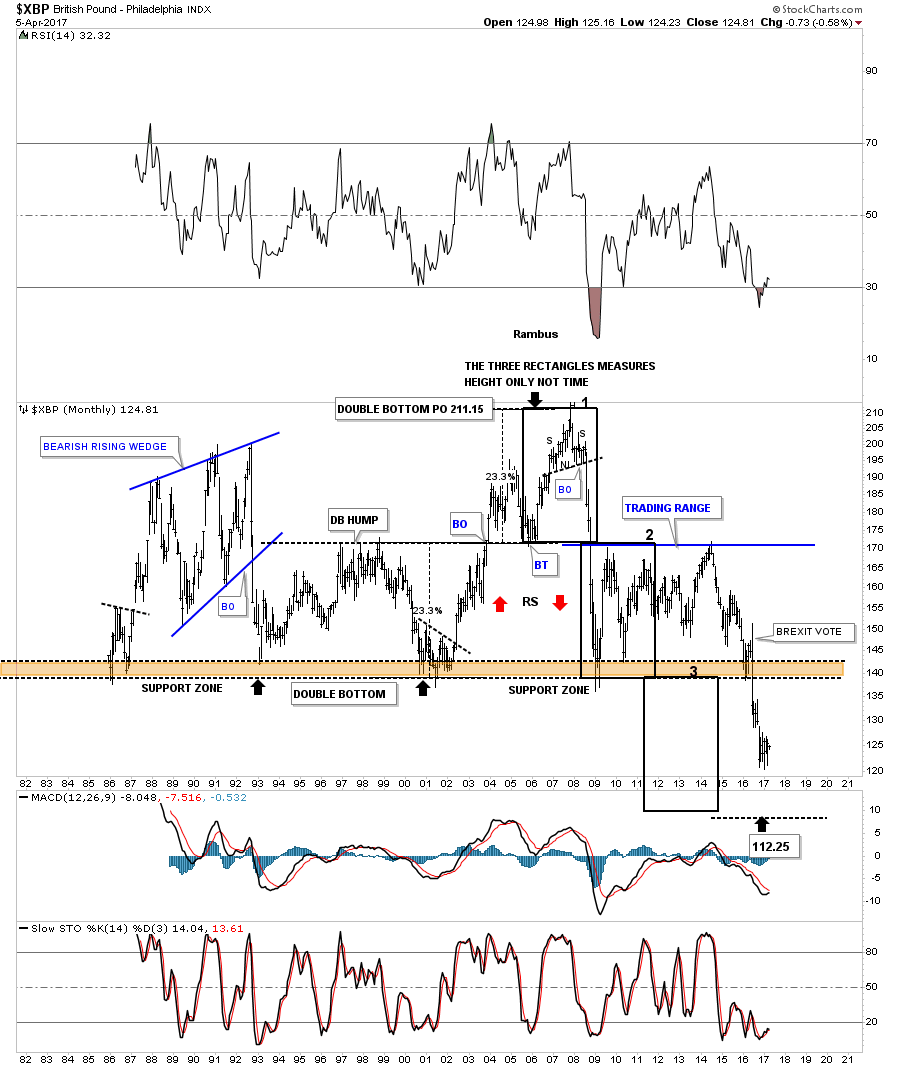
The weekly chart for the $XBP, British Pound, was one of the first times I showed how a triangle can morph into a bigger consolidation pattern, as shown by the red circles. The backtest to the bottom rail produced a H&S top which launched the multiple impulse moves down followed by a consolidation pattern.
The 30 year monthly chart for the $XBP is setup a little different than some of the other major currencies. In the 1990’s the $XBP built out a double bottom which had a measured move up to the 211 area. After the small H&S top was in place the $XBP basically crashed below the double bottom hump all the way down to the previous multi year lows. After chopping sideways for almost 5 years the $XBP took out the multi year lows on the BREXIT vote.

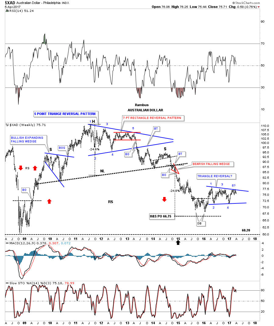
Next is the $XAD, Australian Dollar, which shows its 2011 H&S top with several odd numbered reversal patterns.
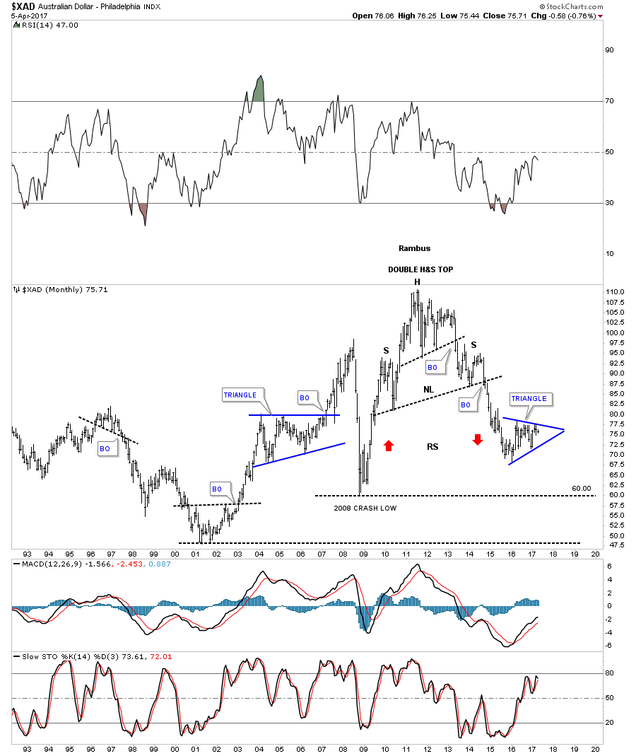
This monthly chart shows the double H&S top and the blue triangle that is currently under construction.

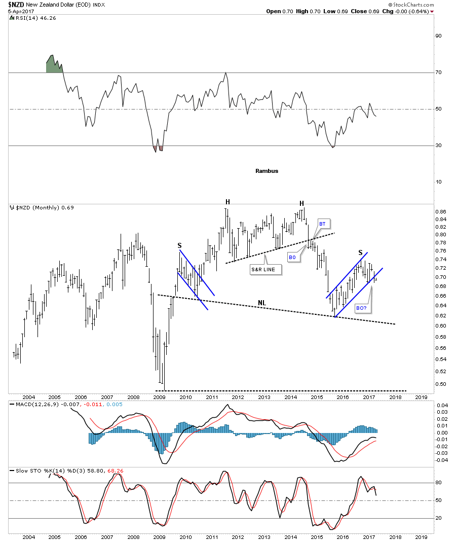
The $NZD, New Zealand Dollar, has been holding up better than most currencies, but it may be getting ready to decline once again, as it looks like it’s breaking down from the blue bear flag that is forming the right shoulder of a large H&S top.
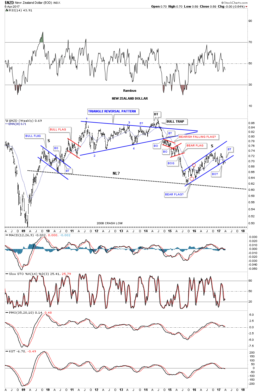
Below is the monthly chart for the $NZD building out the right shoulder.

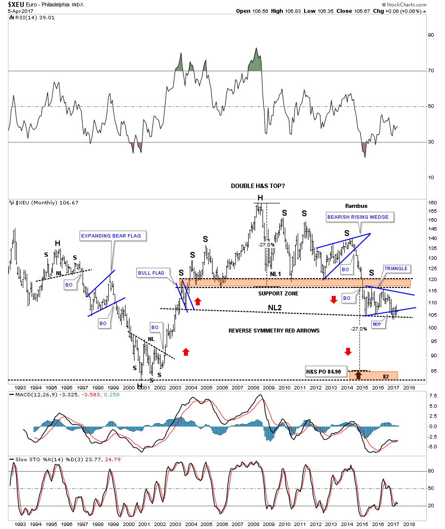
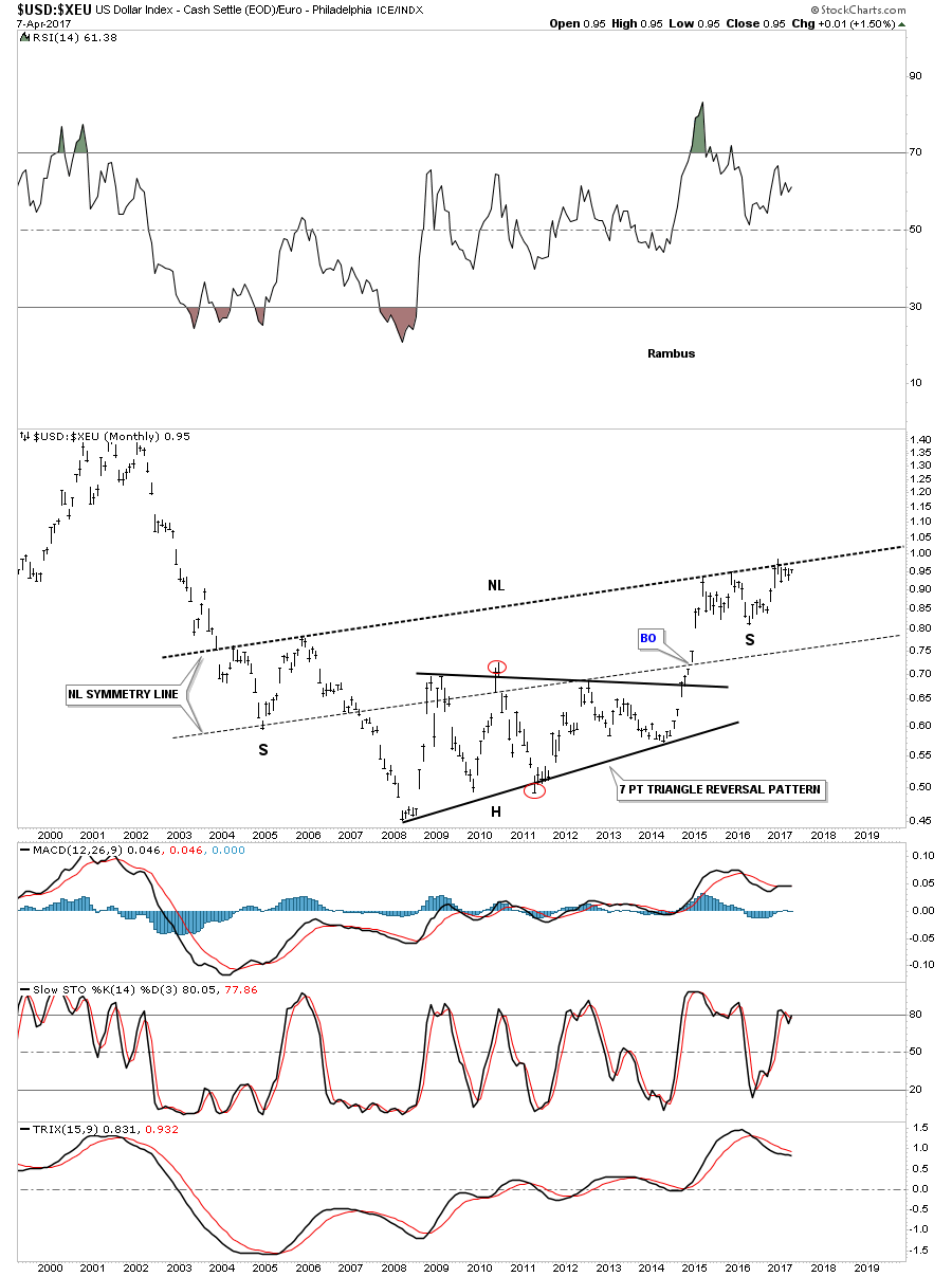
Next is a monthly chart for the $XEU, which shows its massive double H&S top and the blue triangle that is building out the possible right shoulder of the 2nd H&S top.
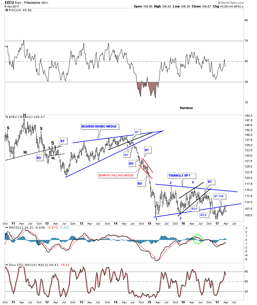
This 7 year weekly chart for the $XEU shows the one year blue triangle that has been building out with a breakout and multiple backtests to the bottom rail which would also be the right shoulder on the chart above.

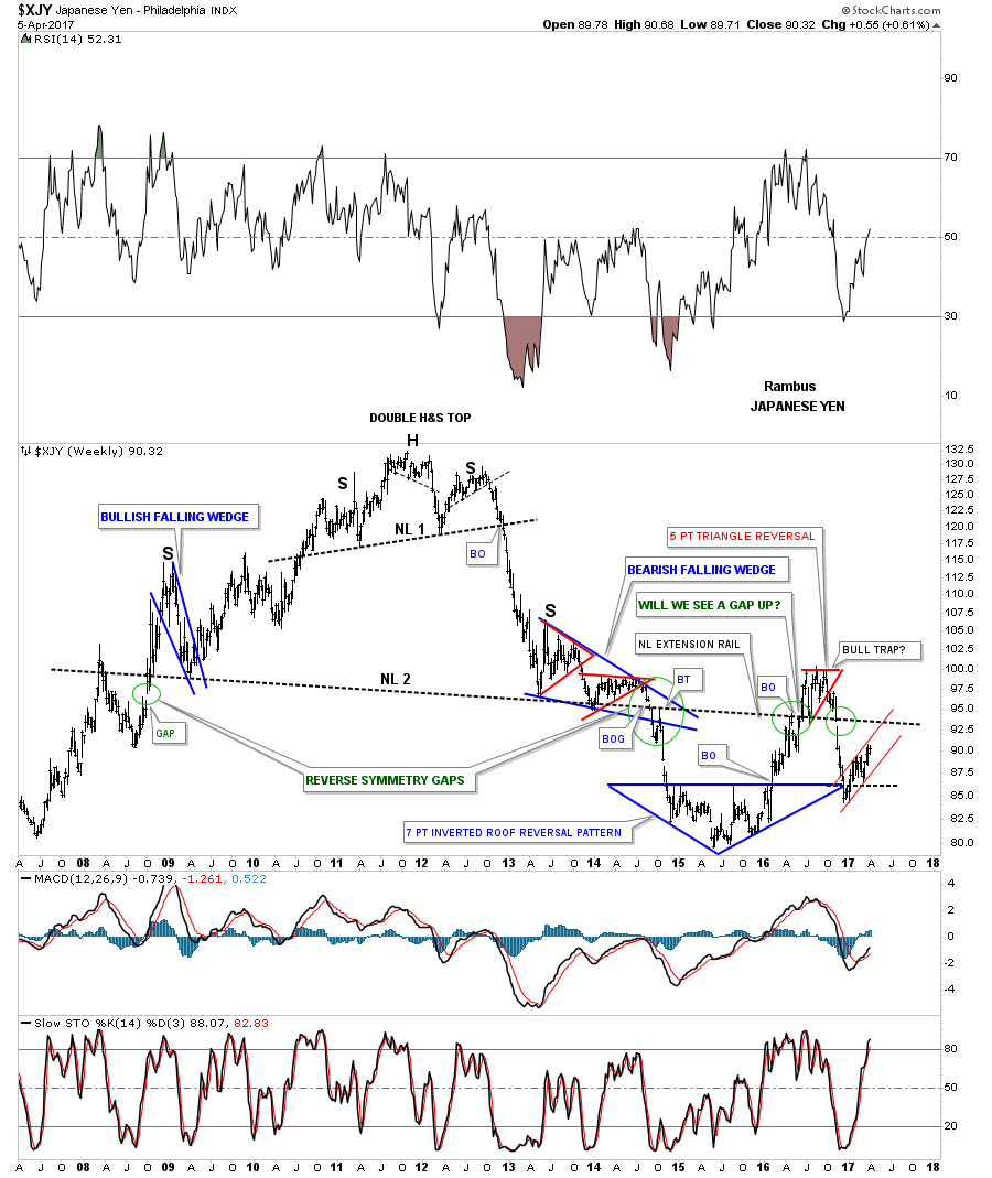
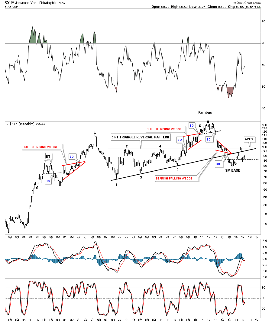
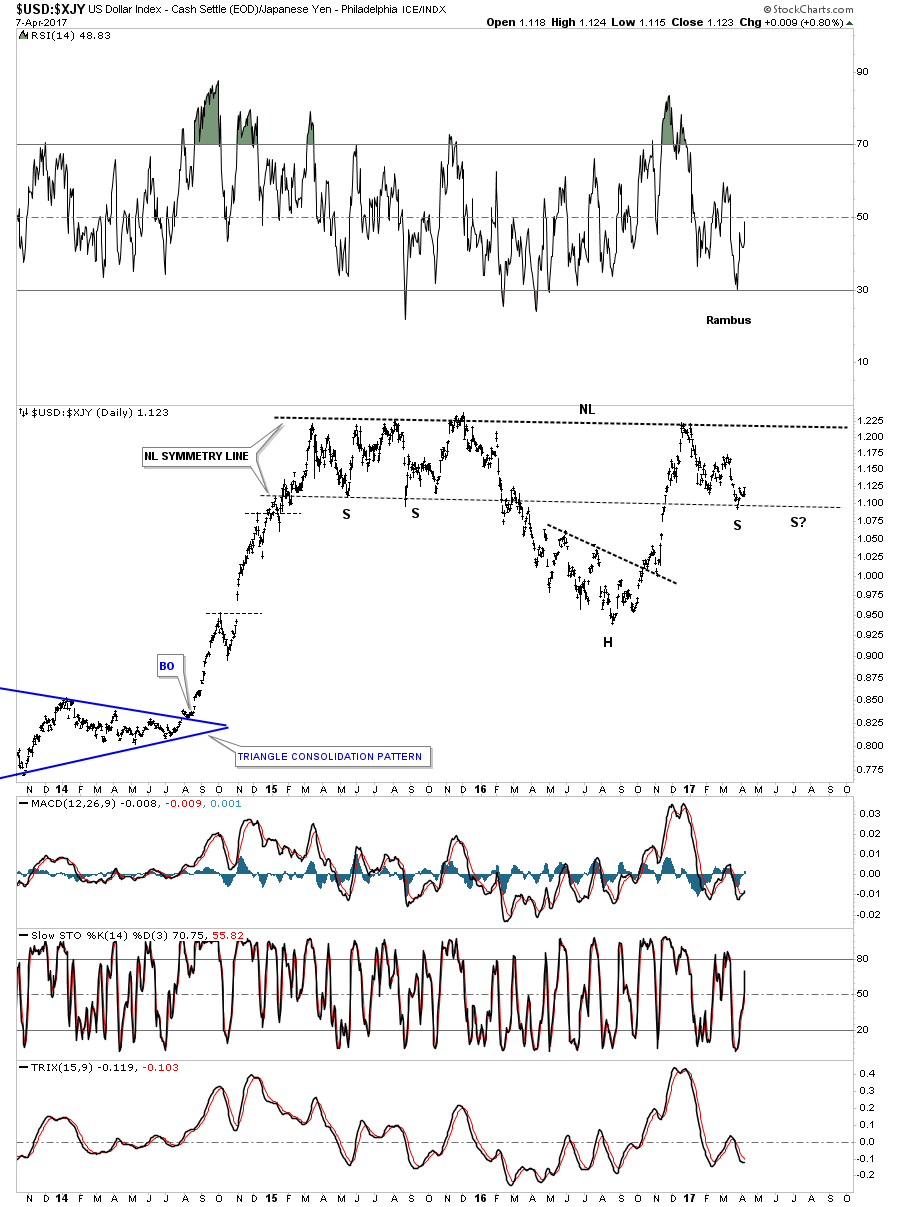
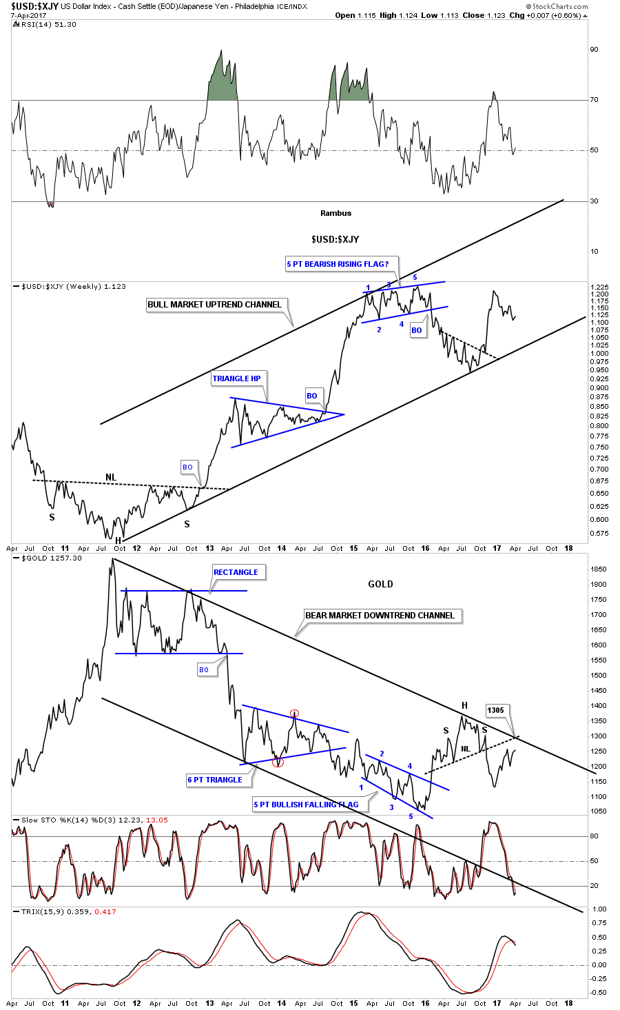
The weekly chart for the $XJY, Japanese Yen, shows its double H&S top. The green circles shows the gaps made on neckline #2 telling us the neckline is correctly placed.
This next chart for the $XJY is a 35 year look whch shows the H&S top that ended its bull market in 2011.

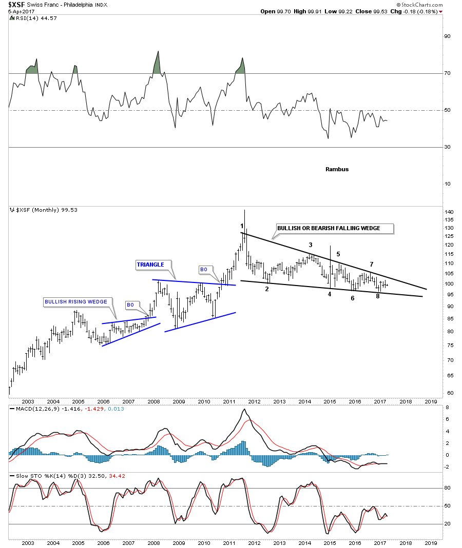
This next currency is a weekly look at the $XSF, Swiss Franc, which looks much different than most of the massive H&S tops we’ve looked at. Starting at the spike high in 2011 you can see a series of lower highs and lower lows which constitutes a bear market.

Whichever way this multi point black falling wedge breaks out a big move will follow.
I’m going to focus in on the US dollar and some of the the US dollar currency crosses in the Weekend Report as there are just too many charts to put into one post. You will see some charts I have not posted before, so stay tuned. All the best…Rambus
Flags produced with Permission from http://www.theodora.com/flags/
An In Depth Look at the Dollar
Buckle Up as this is a long but important one. Make sure to read the Editor’s Note at the bottom to see where this analysis began.
………………………………………..
In part 2 for the Weekend Report I would like to follow up on some long term charts for the US dollar and some currency crosses that may shed some more light on what may be taking place in the medium to longer term view. If one can get the long term look right, it goes along way in knowing which way to trade, as it’s always much easier to trade with the trend than against it.
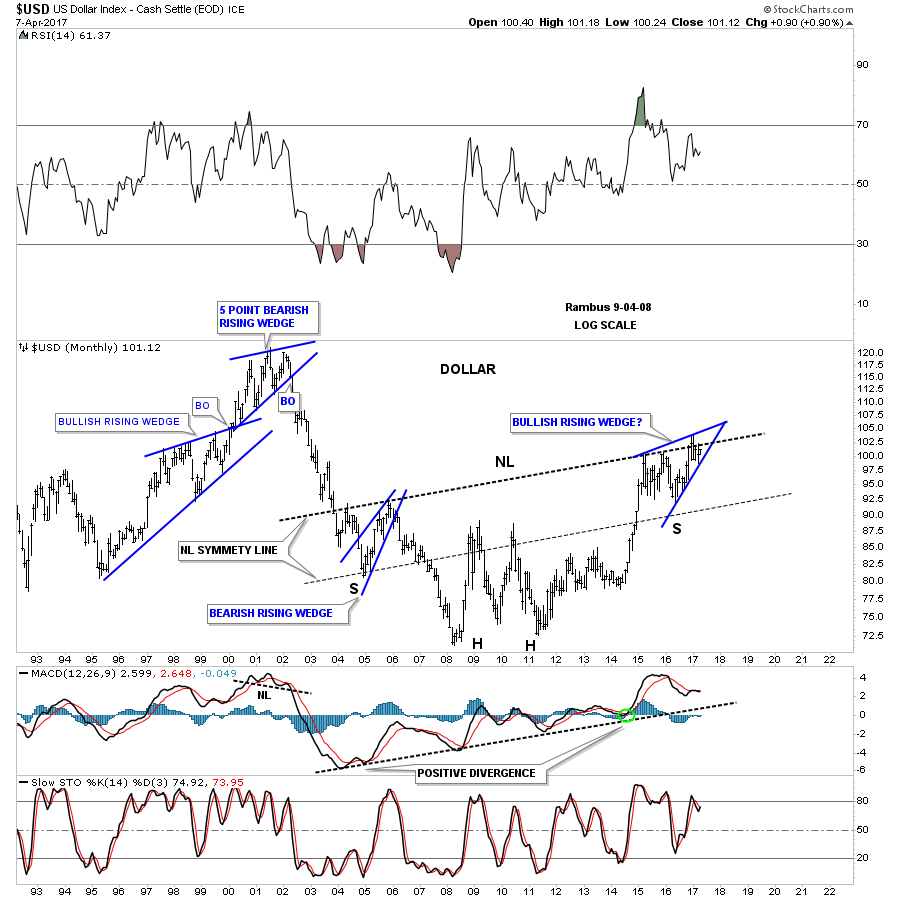
I’m going to start with the 35 year fractal chart for the US dollar which shows what I call big base #1 and big base #2. I’ve had mixed results with fractals which some investors use exclusively to trade with. My experience has been when they work they tend to work very well, but then sometimes at the very last second when you’re expecting the fractal to start playing out they fail, and you are left holding the bag.
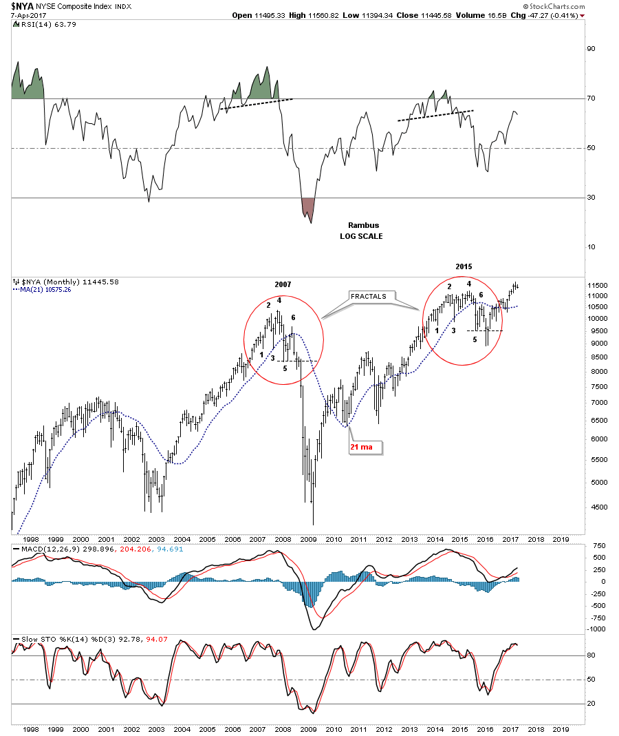
Let me show you an example of a fractal that came about as close to working out as possible, but failed at the very last second. Below is a monthly chart for the $NYA which I was using in 2015 comparing the 2007 top to the 2015 high. When looking at this chart compare the corresponding numbers in 2007 to the 2015 high where the top never materialized. Note how #1 on the 2007 top matched #1 on the 2015 high. Now do the same for each number all the way to #5. If the 2015 high was going to play out like the 2007 top the thin horizontal dashed line at point #5 should have broken down to complete the top, but at the very last second the price action turned on a dime just below point #5, negating the fractal. Also note how the price action in both fractals interacted with the 21 month moving average.
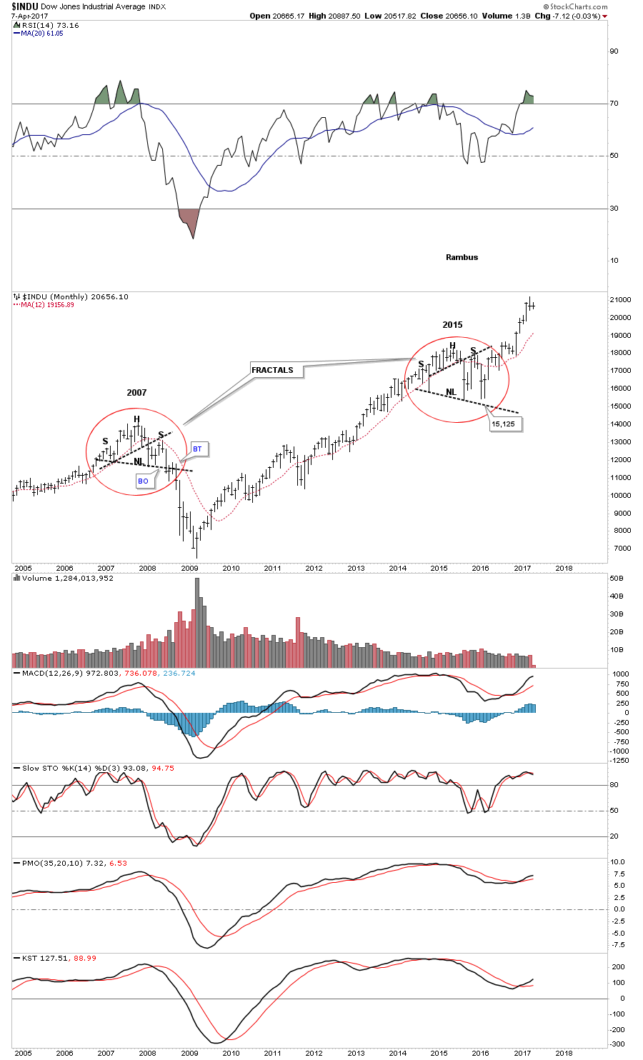
Before we move on I would like to show you one more fractal I was watching in 2015 with the $INDUn comparing the 2007 top to the 2015 high which again failed at the last minute right at the lower neckline. Once the 2015 fractal failed the INDU wasted little time in breaking out to new all time highs leaving the potential fractal in the dust.
The 2 examples above showed two failed fractals which led to a big move in the opposite direction. Now lets look at the two fractals on the US dollar that played out beautifully. Again, match up the numbers on big base #1 to the corresponding numbers on big base #2 to see how well they match up. Confirmation that the fractals were in sync was when the price action broke out of big base #2 with a strong rally completing the fractal.
After the price action broke out above big base #1 the US dollar began to form a consolidation pattern which was the bullish rising wedge that was a halfway pattern to the 2000 high. After the price action broke out above big base #2 it also has been building out a consolidation pattern so the fractals are still in play. This is the fractal chart I’ve been presenting you which shows how the 2 fractals have been playing out.

I know many of you are wondering, why is Rambus showing us all these fractals? That’s a good question and I’ll try to show you why. As you can see on the chart above, the 2 fractals are playing out beautifully so far. Now I would like to show the next step in the fractal development for the US dollar. I’ve been showing you the trading range that began to build out 2 years ago in March of 2015 as a sideways trading range for the most part, with the possible double H&S bottom. Two weeks ago when the US dollar found support it gave me the confidence to show you a possible new fractal which compares the late 1990’s bullish rising wedge to our potential current one, that is currently under construction. The weekly chart below shows how our current rising wedge is building out with 3 completed reversal points, with the fourth one underway that will not become complete until the top rail is hit. So far so good.
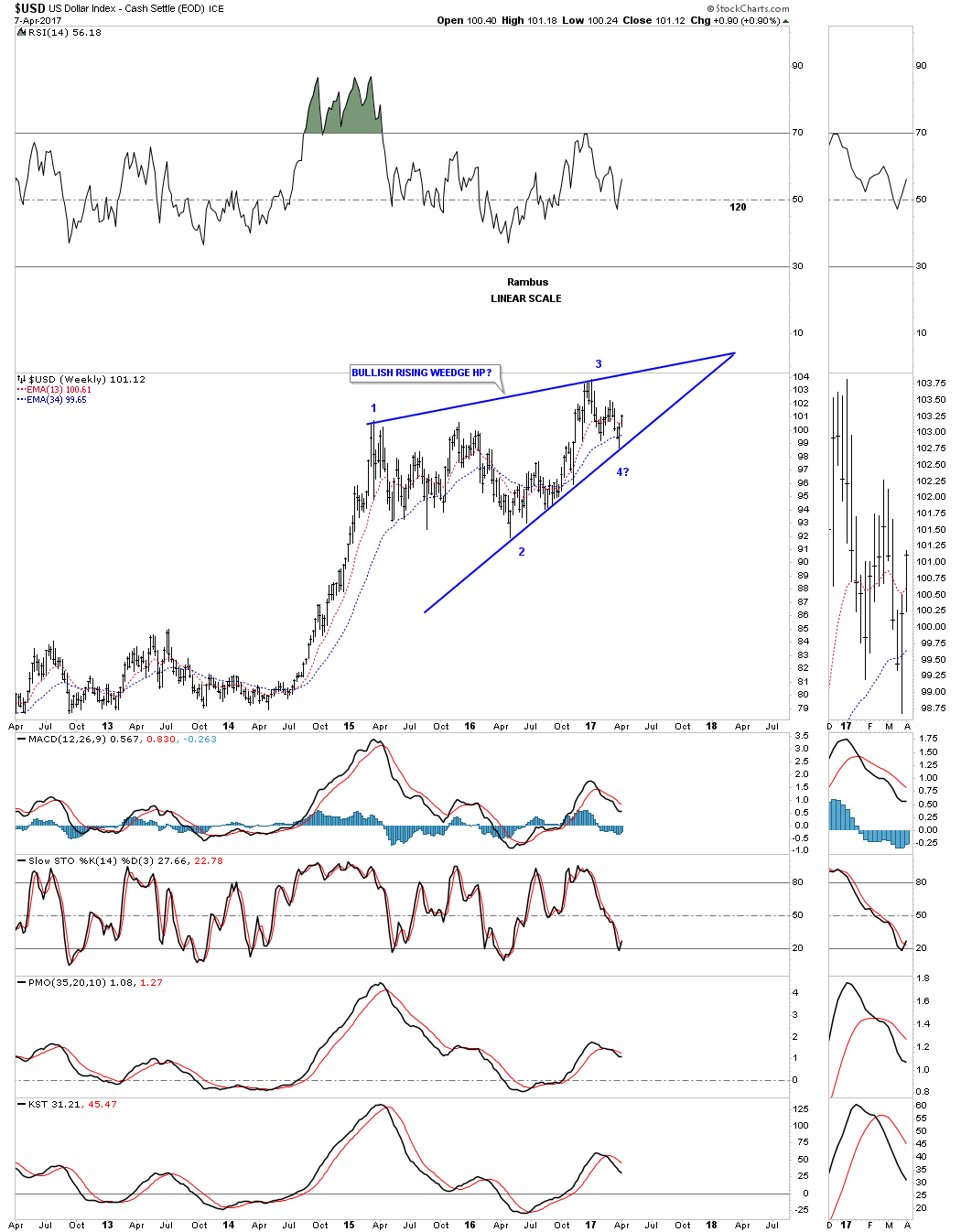
This next chart is a 16 year look at the US dollar which begins to show you how the potential bullish rising wedge fits into the bigger picture. Keep in mind the rising wedge won’t be complete until the top rail is broken to the upside.
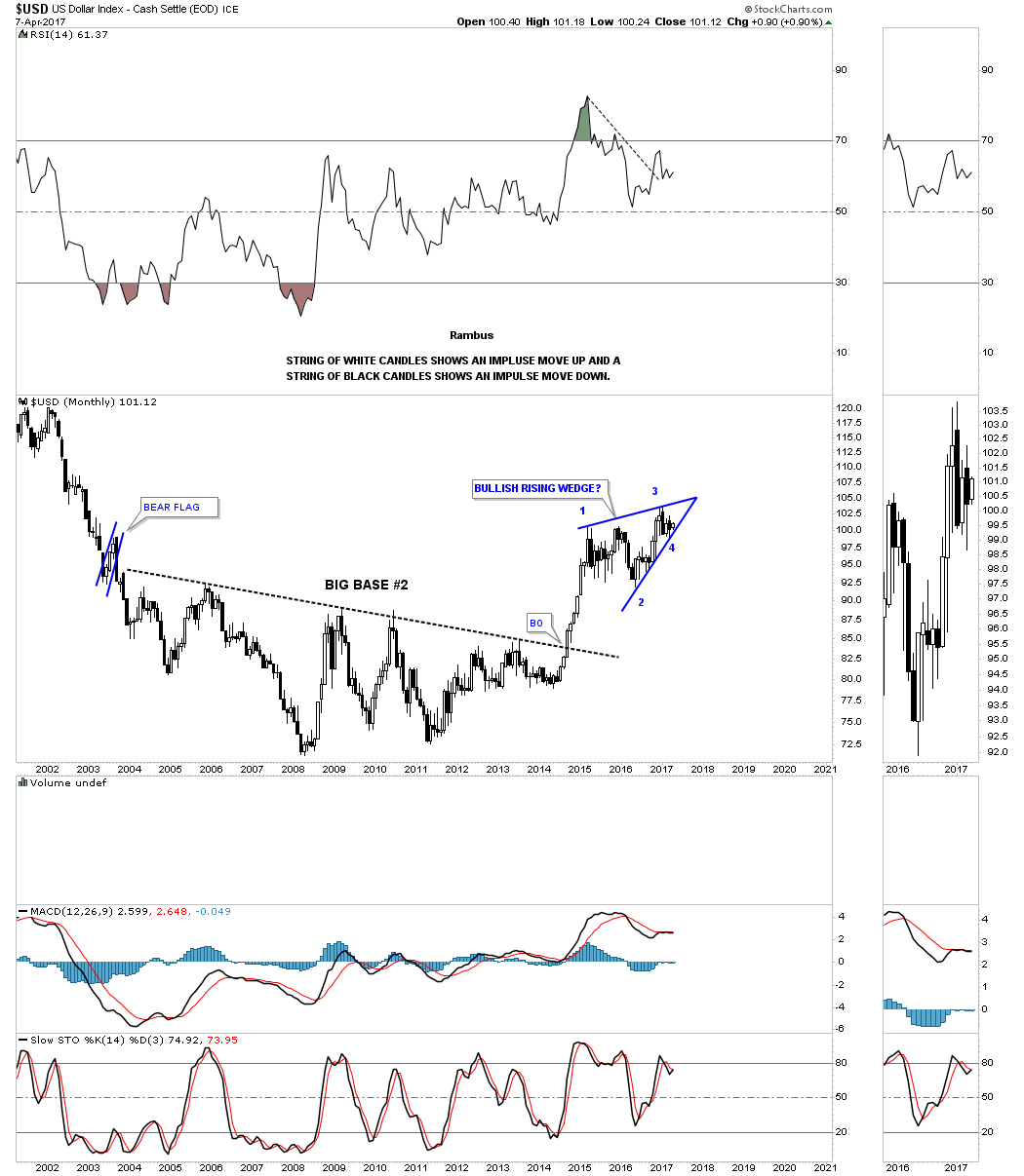
This next 30 year chart for the US dollar begins to put the late 1990’s fractal and our current fractal in perspective. So far the only difference between the late 1990’s fractal and our current price action is that our current uptrend channel is a bit steeper than the 1990’s uptrend channel. It’s also interesting to note that the top rail for each rising wedge is the exact same angle.
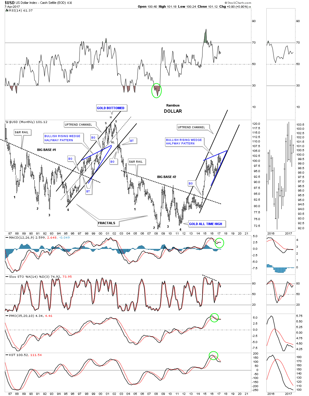
This next chart puts everything together so you can see how the two fractals are playing out in similar fashion. In fractal #1 you can see how I extended the bottom rail of the blue bullish rising wedge down to the beginning of the impulse move up, as shown by the blue arrow. I did the same thing with fractal #2 which show remarkable symmetry. Next I’ve added 3 horizontal dashed lines that match up the price action from fractal #1 to the price action on fractal #2. The bottom dashed line shows where each impulse move up began as shown by the blue arrows. The middle dashed line is taken from reversal point #2 on the rising wedge in fractal #1, which matches up perfectly with the rising wedge on fractal #2. The top dashed line is taken from the 3rd reversal point on the blue rising wedge on fractal #1, which matches the 3rd reversal point on the blue rising wedge on fractal #2 perfectly. At some point all fractals will be broken. It will be interesting to see how long this fractal plays out.

If the bullish rising wedge keeps playing out then there is a very good chance that it will be a halfway pattern similar to the late 1990’s bullish rising wedge. Below is a weekly chart in which I’ve added two brown shaded areas which measures time and price. If, and it’s a big if, but if the potential blue bullish rising wedge plays out as a halfway pattern the US dollar has a price objective up to the 120 area around January of 2018.

There is another big chart pattern I’m seeing building out on the US dollar and some of the other currencies, which is a big H&S bottom. Below is a 25 year monthly line chart which shows the potential H&S bottom building out on the US dollar.
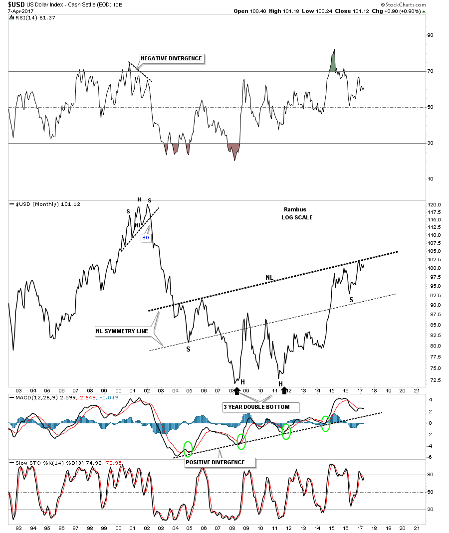
The chart below is the same as the chart above, but this one is a bar chart which shows how the bullish rising wedge may be forming the right shoulder.
If the US dollar is building out a very large H&S bottom then the ratio chart which compares the USD to the XEU should show a similar H&S bottom with the price action rising if the USD is outperforming the XEU.
Below is a 5 year look at the USD to the XJY ratio chart which shows H&S consolidation pattern building out. Last week the price action tested the neckline symmetry line and got a small bounce. The symmetry suggests that this ratio could chop around for some time to build some symmetry to the left shoulder. Right now it’s important to see the neckline symmetry line hold support with a move back up to the neckline.
Below is the long term ratio chart which compares the USD to the XJY which shows a similar massive H&S bottom to the USD, and the USD:XEU long term charts we looked at earlier. It still has some work to do to reach the neckline, but the symmetry is pretty nice from a Chartology perspective.

This next chart is the same one as above, but in bar form.

Below is a combo chart which has the USD to XJY ratio on top and gold on the bottom. As we all know there is an inverse correlation the USD: XJY has with gold which isn’t absolute, but pretty close for the most part. If the ratio chart on top is building out a H&S bottom then there is a good chance that gold should be building out a H&S top. As you can see neither pattern is complete yet, but if they do, what does that tell us about where gold may be headed.
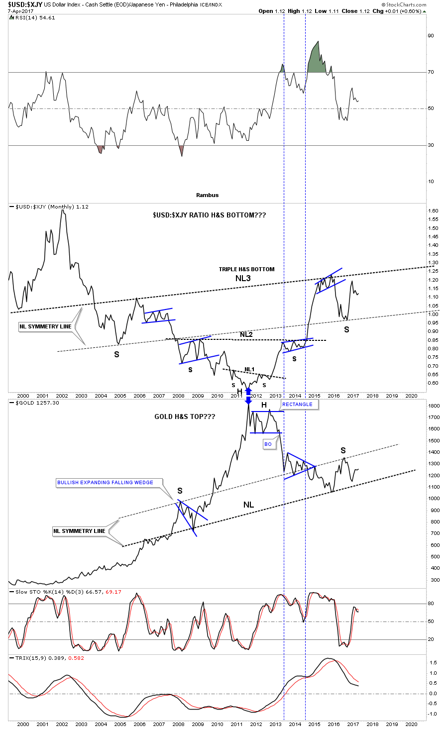
I would like to finish up by looking at a 7 year weekly chart for the USD to XJY ratio on top and gold on the bottom. Note how the ratio bottomed out in 2011 while gold was topping out at the same time. From that point in time the ratio chart has been in a confirmed uptrend channel while gold has been in a confirmed downtrend channel.
From a Chartology perspective it’s charts like the ones we looked at tonight which keeps me defensive about the precious metals complex in general. It’s not about putting a bunch of lines on one chart and expecting it to be the holy grail. It’s more about looking at many charts from different areas and putting all the pieces of the puzzle together to form some type of game plan. As long as the game plan keeps working there is no need to change things. If I see some of the patterns start to fail on the charts above I will have to reevaluate things to see where the problem lies.
The other question that remains is what is going to happen to commodities if the US dollar begins its next impulse leg higher? Will it be different than the last impulse move up when commodities and currencies took a beating? Maybe it will be different and everything goes up together, but I will believe it when I see it, and not the other way around.
As I showed you at the beginning of this post fractals can fail at any time and lead to a big move in the opposite direction which is something I’m keeping a close eye on. For the time being I’m content to watch how things unfold over the short to intermediate term timeframes looking for clues that may throw off my game plan. All the best…Rambus
Editor’s Note:
On March 10 2013 ( 4 years ago) Rambus Posted a piece called :” Dollar Bears Prepare to Hibernate” :
This post caused a lot of negative feedback at the time. Rambus was ridiculed by many.
It contains many short term charts which are not pertinent now but here is the crux of the post (which was made with the Dollar Index at 82 and Gold at 1600)
Excerpt from “Dollar Bears Prepare to Hibernate” March 10 2013 :
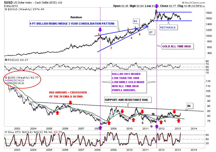
“This next chart for the US dollar is a very long term monthly chart that goes all the way back to 1980. Sometimes in charting one can have an Epiphany or an eureka moment where all of a sudden there is clarity beyond what you were initially looking for. I had such a moment with this next chart that has a lot of information on it. First you will see two bases labeled Big Base #1 and Big Base #2. These two bases are uncanny in their similarities. Some might call them fractals. The two bases are almost exactly the same height as well as time. The only real difference between the two bases is at point #3 which was a tad higher on Base #2 whereas in Base #1 it was a little longer. Other than that they are amazingly similar. Note the breakout and backtest from Base #1. If you look real close you can even see a small gap that was made right at the breakout point. The support and resistance rail held on two backtests which told us the S&R rail was hot. Note the blue bullish rising wedge that worked out as a beautiful halfway y pattern. The height of Base #1 also measured out real close to the high where you can see the H&S top. As I said there is alot of information on this chart so I’ll post it right here and carry on with the same chart again a little further down.
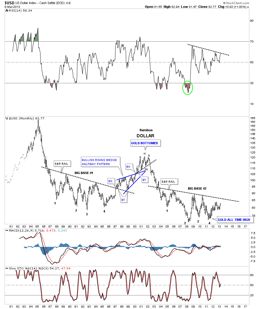
Carrying on with the same chart there is another important observation I would like to share with you. Note the H&S top that formed back in 2000. If you look at a gold chart you will see a big inverse H&S bottom that launched its bull market. A dollar top and a gold bottom. Now I want to draw your attention to the bottom right hand side of chart that shows point #4. That low at point #4 marked the absolute high for gold back in the fall of 2011. So what is this chart telling us? Strictly from a Chartology perspective I think it’s talking loud and clear to us. If that S&R rail on big base #2 gives way we are looking at a multi year rally for the US dollar and most likely a decline in the precious metals complex.
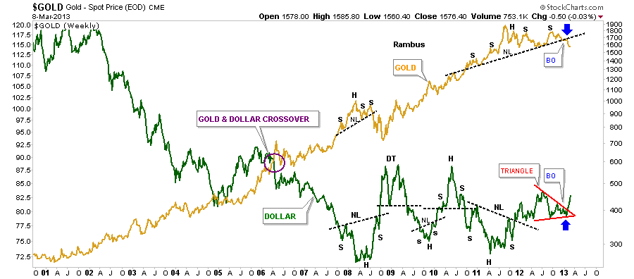
Lets now look for some clues to see if the process has started where a rising US dollar is having a negative effect on gold. This next chart is a combo chart that shows gold on top and the US dollar’s big base #2 on the bottom. I want to focus your attention to the two purple dashed lines with the purple arrows. What the purple lines tell is how the dollar was showing us back in the fall of 2011, when gold was making its all time at 1920, the dollar failed to make a new low even though gold went nearly parabolic. This is a very big clue that the dollar was bottoming out. The dollar never made a new low after its low in 2008 while gold rallied almost $1000 dollars into the fall of 2011. That is a pretty big positive divergence for the US dollar to gold.
I could show you several more charts comparing gold to the US dollar but this article is getting a little long in the tooth so I’ll leave you with just one more chart that is a 13 year weekly line chart. I know some of you won’t believe this next chart because it doesn’t meet all the strict rules for H&S top pattern. That’s fine because I have seen countless H&S tops, similar to the one gold is showing right now, play out beautifully. Some will say the neckline is to steep or the symmetry isn’t there or the volume isn’t right. I could go on and on but until the price action breaks above that neckline on the gold chart below it is what it is. With the US dollar breaking out from that red triangle while gold is breaking down from it’s H&S top the breakouts match up pretty closely.
A good chart should tell a story that everyone should be able to understand even the folks that really don’t understand charting. These charts above are telling us a story of what is about to happen with the US dollar over a several year period. Investors create the charts, I don’t. I only interpret their actions by uncovering what they are doing. Charting IMHO follows the price action better than most disciplines whether it’s Elliot Wave, which there are some good analysis out their, cycles, or the fundamentals. Right now the folks that are watching the technical indicators, in the precious metals stocks, have been beaten up waiting for the bottom to form. The same is true in the stock markets right now. All the technical indicators are telling investors that the Dow is so overbought it can’t go any higher until there is correction but the Dow keeps on going up regardless of what the indicators are showing. Yes at some point there will be a good correction as there always is. I’m sure you have heard the saying that the markets can stay overbought or oversold longer than one can hold out if one is on the wrong side of trade. No truer words have ever been spoken in regards to the precious metals complex or the stock markets at this time. All the best…Rambus”
The link to the whole post can be found here.
https://rambus1.com/2013/03/10/dollar-bears-about-to-go-into-hibernation/
U.S. & World Stock Markets
The Most Hated Bull Market in History
Prepared on May 01, 2017The PM complex has been taking up most of my time the last couple of weeks so tonight I would like to update you on some of the stock market indexes. No matter how one wants to spin it the US stock markets have been in a bull market since 2009 by any trading discipline. It has climbed the proverbial wall of worry which is needed to create such a dynamic bull market. Most of the charts will be long term in nature which puts the bull market in perspective.
The first chart is a 20 year monthly chart for the INDU which shows you “The most hated Bull Market in History”. Below the INDU chart is just a plain chart for Gold with no annotations on it. One is in a bull market and the other isn’t. Where has your money been ?
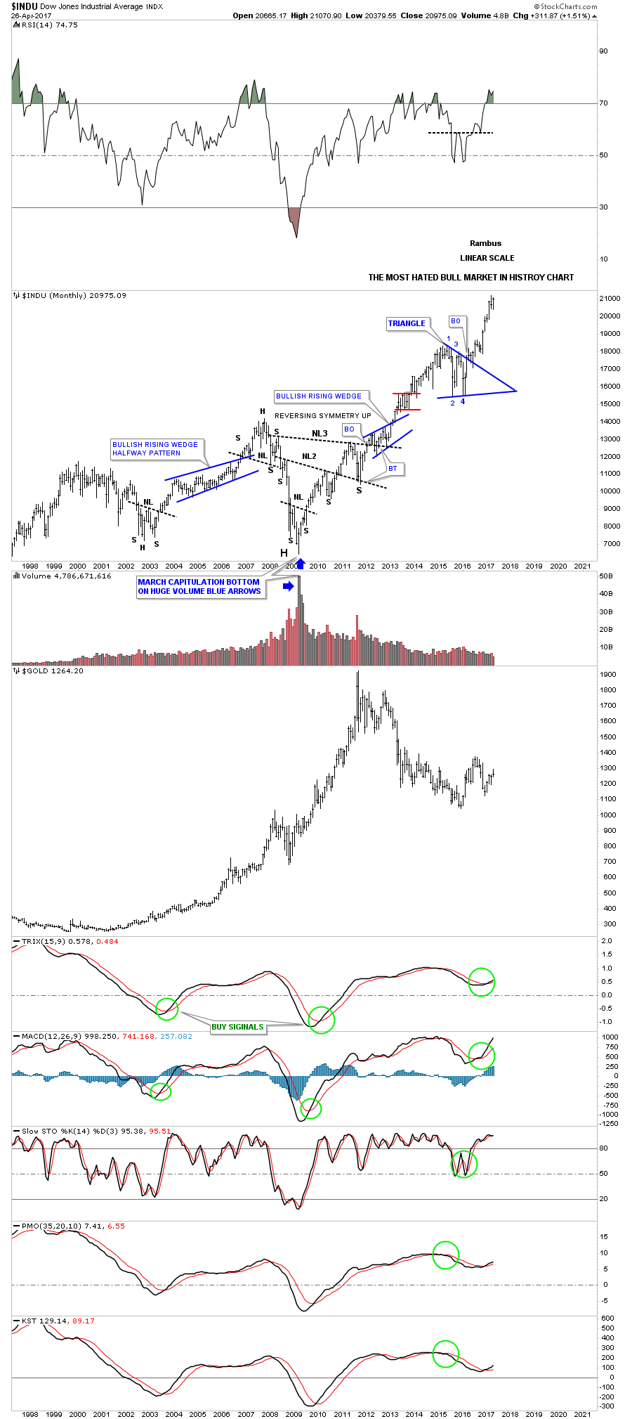
We’ve been following this next chart since the day it broke out above the top rail of the “Jaws of Life” pattern back in November of 2013. Little did I know at the time that the backtesting process would take nearly 2 years to complete, but in the end it was worth the wait. https://rambus1.com/2014/11/19/wednesday-report-49/

The quarterly line chart shows the beautiful Jaws of Life consolidation pattern with a perfect breakout and backtest to the top rail.
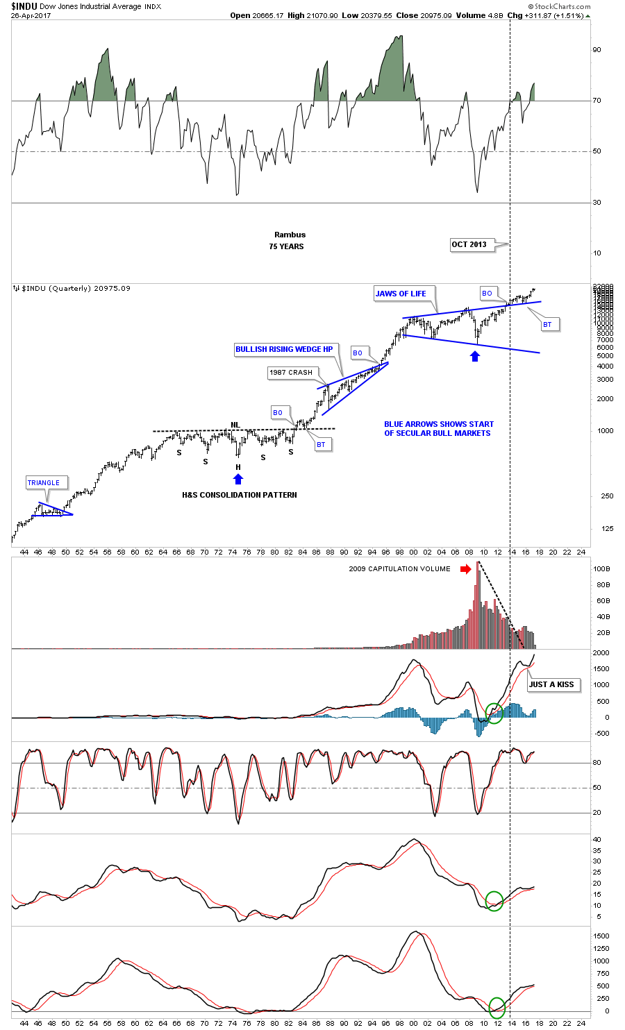
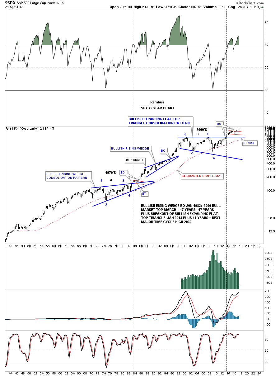
To understand what is really taking place right now in the big picture, this 75 year chart for the INDU puts everything in perspective and is probably the most important chart to view. Very few investors on the planet can even grasp what a chart like this is saying let alone let alone invest their hard earned money in what it’s saying. Keep in mind we’ve been following this Jaws of Life consolidation pattern actually before the INDU finally broke out in October of 2013. Compare the breaking out and backtesting process of our current Jaws of Life to the massive H&S consolidation pattern of the 1970. We are currently in the early stage of an impulse leg up which takes place after a consolidation pattern is finally matured.
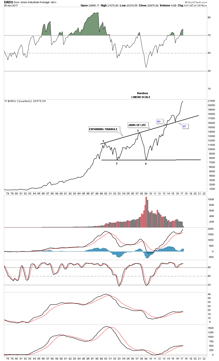
Below is a 20 year monthly chart for the SPX which broke out of its massive 13 year flat top expanding triangle in 2013 and has never looked back.
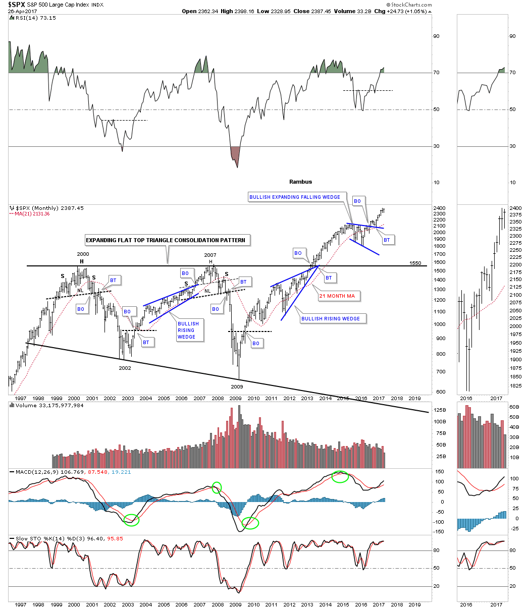
This 75 year quarterly chart for the SPX that is similar to the 75 year quarterly chart for the INDU we looked at earlier. During its 1970’s consolidation period it formed a bullish rising wedge which led to its secular bull market. The 2000’s built out it’s recent massive consolidation pattern, the flat top expanding triangle. Note how small the 1987 crash looks on this long term chart, It was was the end of the world back then.
If the 75 year charts for the INDU and the SPX are showing us that we are in a secular bull market then we should see the Transportation Average confirm the bull market is for real. Below is a 20 year monthly look at the Transportation Average which shows a very symmetrical H&S bottom with the head forming at the 2009 crash low. Note the price action at the top of the chart that broke out of a smaller well defined H&S consolidation pattern.
![]()
The 100 year quarterly chart for the Transportation Average is trading up close to its all time highs after breaking out from is large H&S consolidation pattern we just looked at on the chart above.
![]()
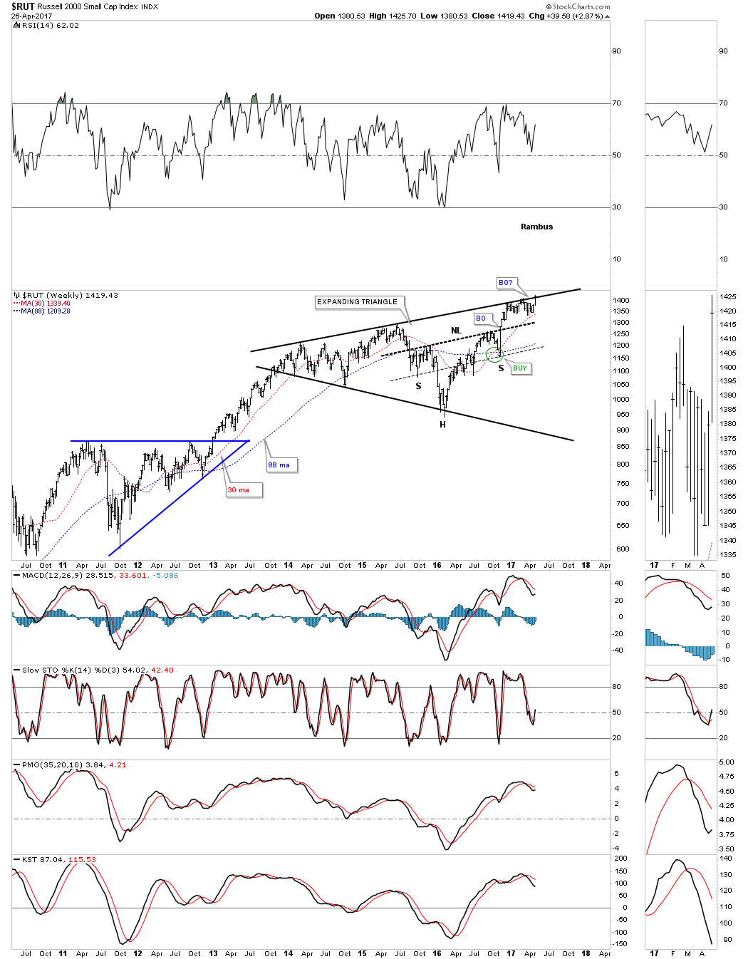
The reason the RUT has been lagging a bit lately is because it has been testing the top rail of its almost 5 year black expanding triangle. The H&S that makes up part of the expanding triangle strongly suggests that the RUT is going to breakout to new all time highs which it is doing this week.
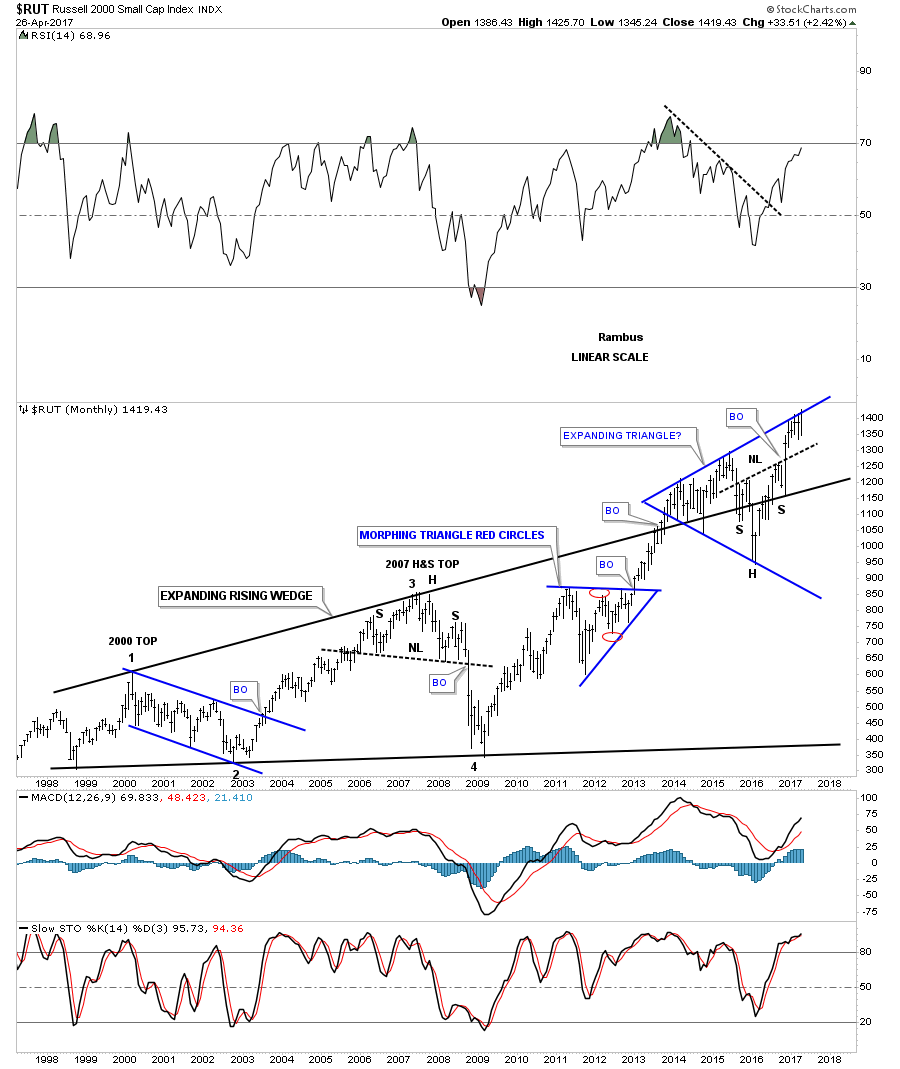
Below is a 20 year monthly chart for the RUT I’ve never published before. It’s similar to the Jaws of Life, but this big consolidation pattern is a 15 year bullish expanding rising wedge. Again, note the big H&S consolidation pattern that is making up part of the blue expanding triangle we looked at on the chart above. That is telling us that the breakout above the top rail of the blue expanding triangle is going to take place.
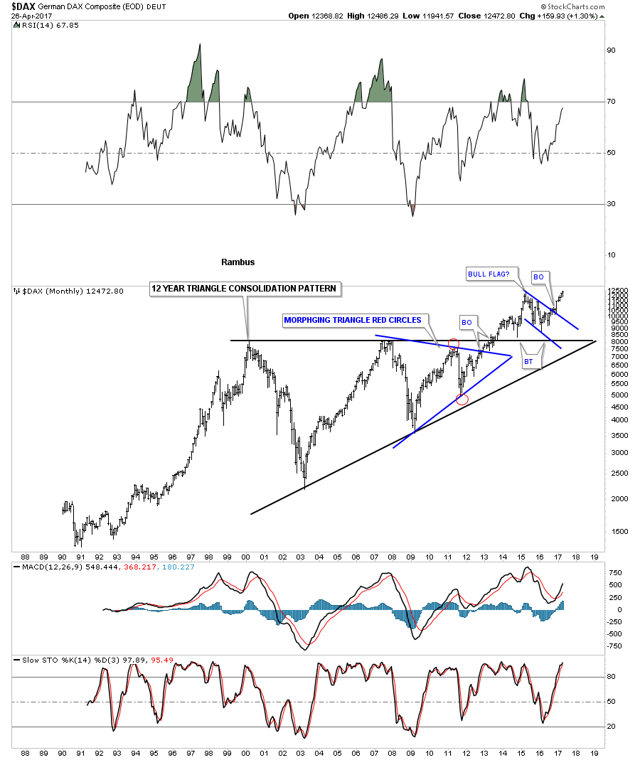
Lets now look at a few “foreign” markets to see what they look like starting with the $DAX. Just like the US stock markets the DAX built 12 year black triangle consolidation pattern with the smaller blue triangle pattern building out toward the apex letting us know the big pattern was going to breakout to the upside. Six months ago the DAX broke out of the blue bull flag on its way to new all time highs.
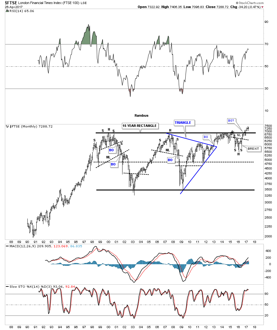
The FTSE built out a massive 15 year rectangle consolidation pattern. Note the small H&S bottom that formed just below the breakout point which told us the breakout would happen.That right shoulder was formed during the night of the BREXIT vote when it looked like the end of the world for England.
There are a few individual sectors that have been consolidating for some time now which look like they may be ready to make a move. This first sector is the $BKX, banking index, which broke out of a black expanding triangle late last year and has been in backtest mode testing the 30 week ema this week as support.

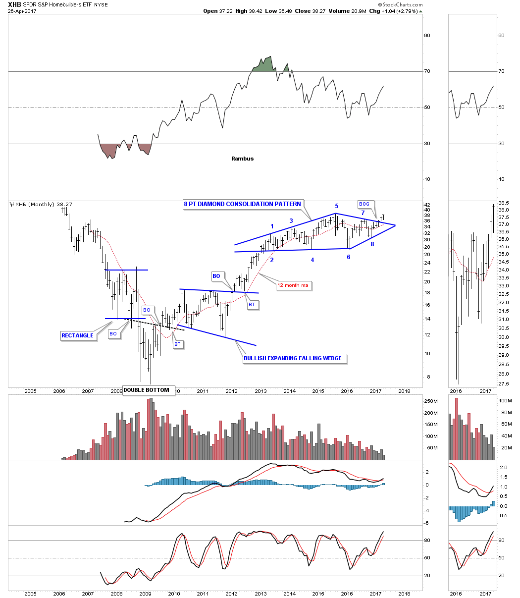
Another important sector that is just breaking out of a large consolidation pattern is the XHB, Homebuilders etf. Last month it broke out above the top rail of a beautiful 4 year 8 point diamond consolidation pattern.
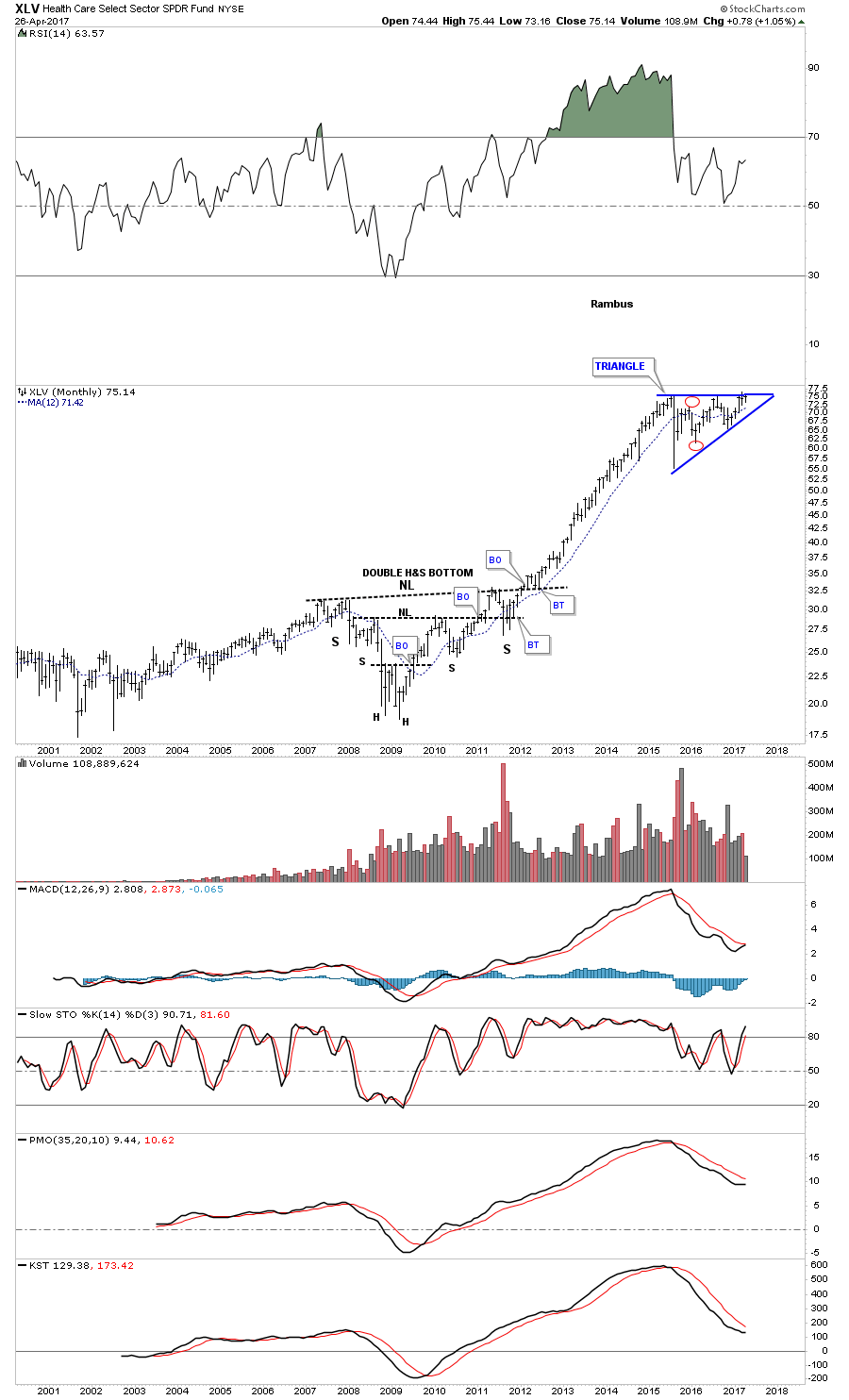
The XLV, healthcare sector, has built out a year and a half triangle consolidation pattern. As this sector was one of the strongest out of the 2009 crash low it needed to consolidate those gains by building out the blue triangle consolidation pattern.
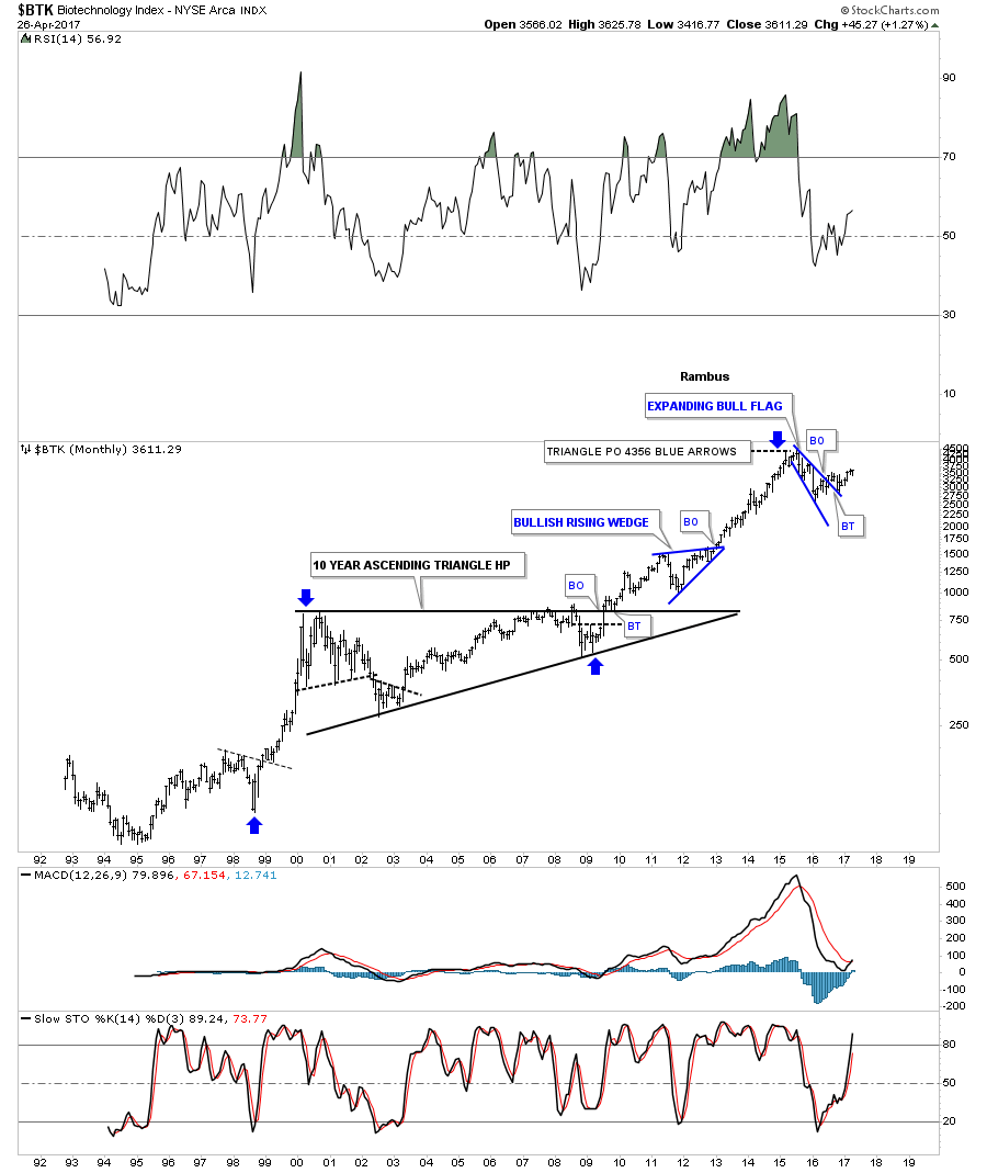
Probably the strongest sector of all out of the 2009 crash low was the $BTK, biotechnology sector, which has been consolidating for the last year and a half forming a blue expanding bull flag.
For the last year and a half the $SOX, semiconductor index, has been leading the tech sector higher.

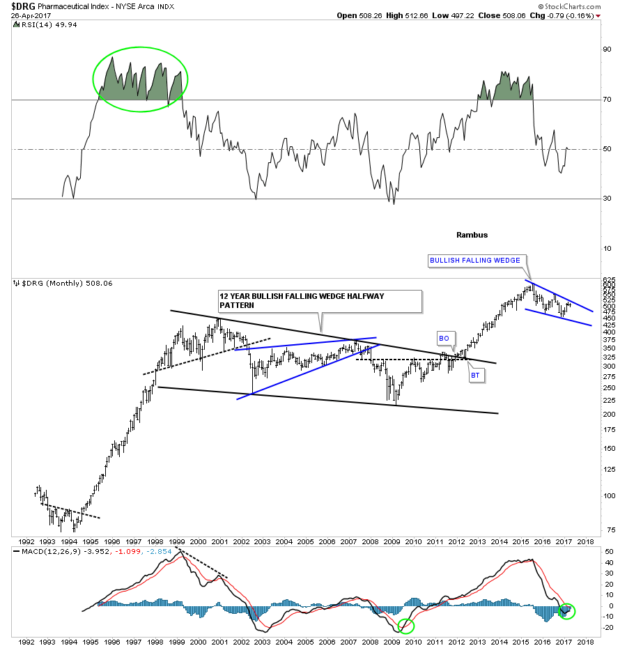
This last sector we’ll look at tonight is the $DRG, Pharmaceutical index, which is building out a possible bullish falling wedge which has formed at the top of massive impulse leg up out of the black 12 year bullish falling wedge.
When I look at all these charts above it’s hard for me to see a long term bear market on the horizon. We are going to get the inevitable corrections along the way which occurs in any bull market, but knowing the main trend is the most important part of being successful when it comes to the markets. Shorting this bull market consistently has been a tough game to play vs just going with the bull market. All the best…Rambus